Showroom05Restaurant — fine dining
Casa Marea
Salt and marine
A Mediterranean kitchen priced at the top of its street, with a menu that is a page instead of a PDF.
- Brand
- Casa Marea — Coastal Kitchen
- Where
- Coconut Grove, Miami
- Sector
- Restaurant — fine dining
- Quoted as
- Premium Websites · SignatureFrom $4,500
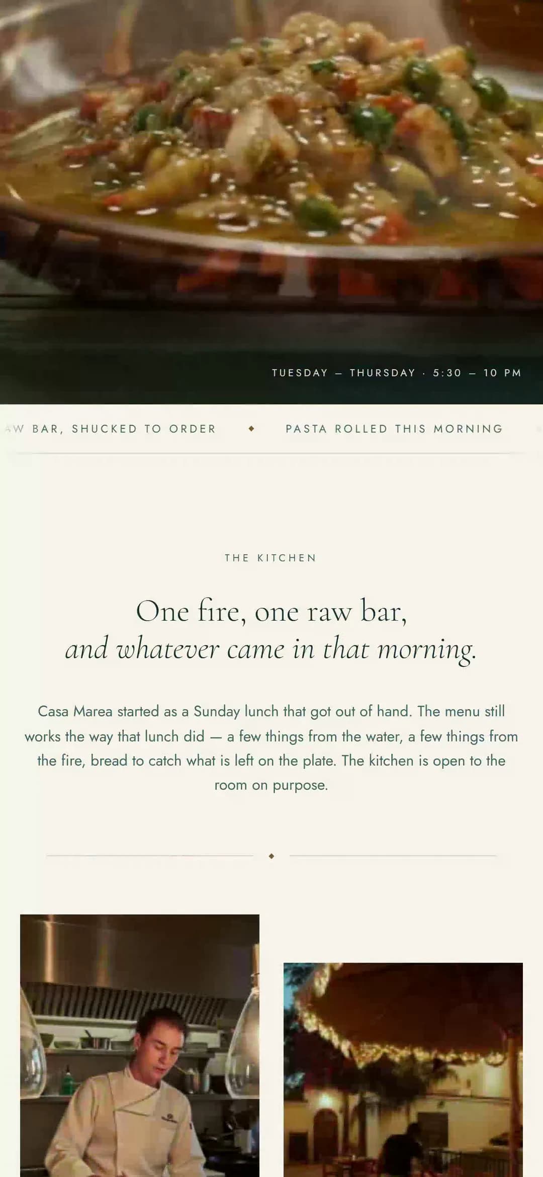
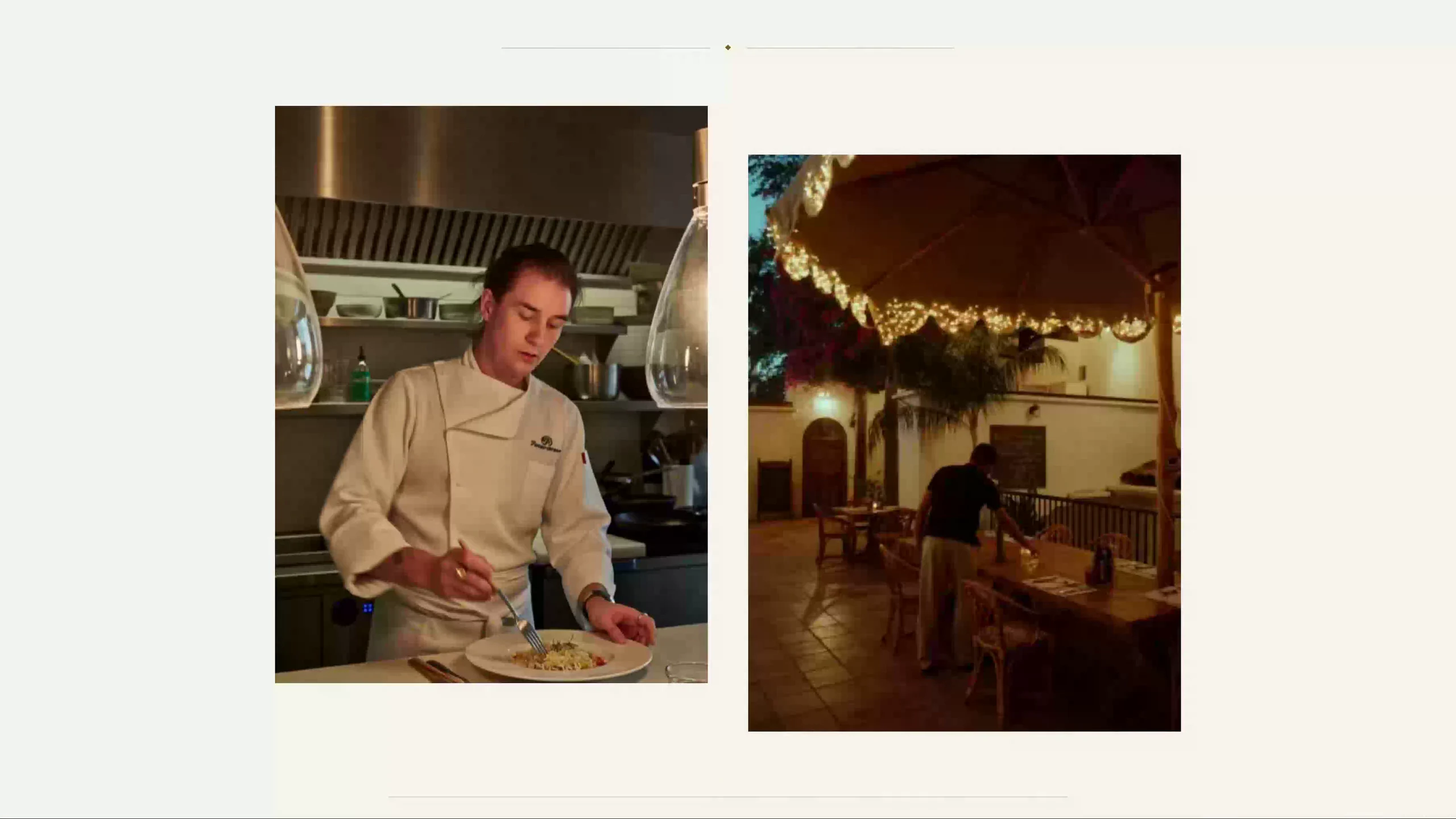
The courses switch, the plates rise, the sitting pill slides and the reservation confirms with the date read back. Open it on a phone — that is where it was drawn first. Every dish, price and sitting on it is invented, and no table is held.
New tab — the frame above is already running it.
01 — The brief
Warm cream and terracotta is the house style of every Mediterranean restaurant on Grand Avenue, and it prices a kitchen at thirty-eight dollars a plate. This one charges ninety-six for the ribeye and holds a two-week book. The site had to stop looking like the neighborhood and start looking like the bill.
02 — The direction
Salt and marine
Three moves, in the order they were made. Everything after this page — the palette, the type, the sections — falls out of them.
- 01
The ground got colder and quieter
Salt paper instead of cream, deep marine instead of olive, and the terracotta gone entirely — because the only color a restaurant at this price can afford is the food. Brass survives, rationed down to the signature marks and one rule.
- 02
Composition went symmetric
Centered mastheads, hairline rules, wide-tracked small caps: the language of a printed carte rather than of a landing page. Nothing on the page sits off-axis except the plates, which is exactly where the eye should break.
- 03
One room inverts
From the wood fire is a marine band where the three signature plates arrive one at a time as the page is pinned. It is the only place the site raises its voice, and it raises it for the kitchen rather than for itself.
03 — Palette
The colors, and what each one is for.
Every value here is a real token in the build. A palette with a role written beside each color is a palette somebody can hand over — which is the difference between a design and a decoration.
Shell
The page. Salt, not cream
Cream
Cards and the menu panel
Sand
One wash, under the gallery
Line
Rules, and the dotted leaders
Deep
Type, and the wood-fire room
Sea
Descriptions, notes, hours
Brass
Signature marks. Four a page
04 — Typography
Two faces, and the reason for both.
Display
Cormorant Garamond
Aa Bb Cc 0123
The quick brown fox jumps over the lazy dog — 1234567890
An old-style roman with very high contrast and a fragile italic, set light and set large. It is the face of a wine list rather than of a menu board, and it holds a dish name at twenty-two pixels without the course turning into a table.
Text
Jost
Aa Bb Cc 0123
The quick brown fox jumps over the lazy dog — 1234567890
A geometric sans doing the modern half of the argument — hours, prices, the reservation form. The tension between a sixteenth-century roman and a Bauhaus sans is the restaurant’s whole positioning, in two typefaces.
05 — What it does
The part a template cannot copy.
A menu built for the table QR
Courses in service order, prices as plain numbers, and a description short enough to read on a phone at a dim table. A seasonal change is an edit, not a reprint.
Reservations by sitting, not by dropdown
Date, party and sitting are chips with one pill sliding between them, because choosing 7:30 over 9:00 is the real decision and a native select hides it behind a tap.
The three plates, in the order they leave the pass
A pinned sequence rather than a grid — fire, then water, then pasta. A tasting menu arrives one thing at a time and so does this.
Everything the phone call was about
Hours, parking, private events and the map, on the page. Reduced motion gets the same three plates as a plain stacked list rather than a broken animation.
Next in the showroom
LUMENMidnight, warmed