Showroom10Fitness — boutique studio
FORMA
The board goes first
A studio that puts its entire week on the page — thirty-six classes, every coach, every spot left — and prices membership against how often you will honestly turn up.
- Brand
- FORMA — Training Studio
- Where
- Edgewater, Miami
- Sector
- Fitness — boutique studio
- Quoted as
- Premium Websites · BeyondFrom $6,500
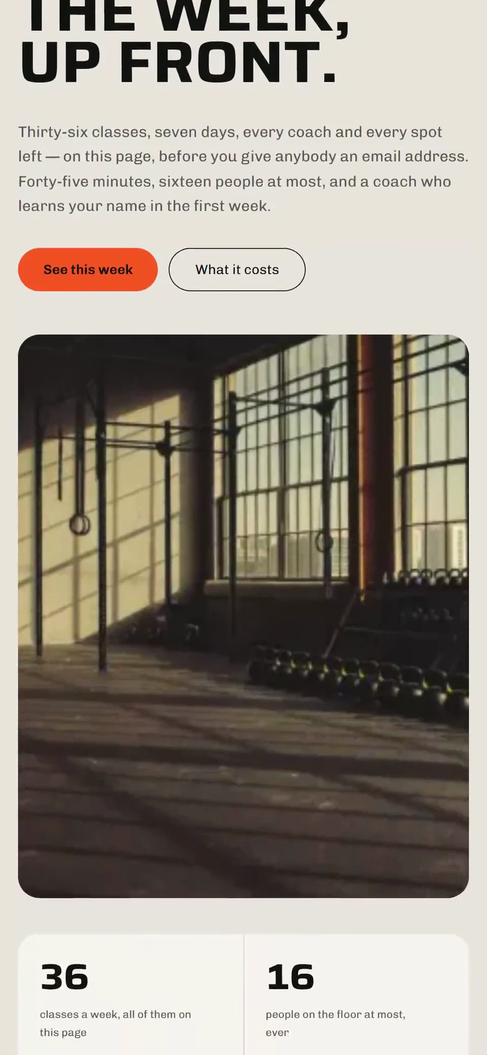
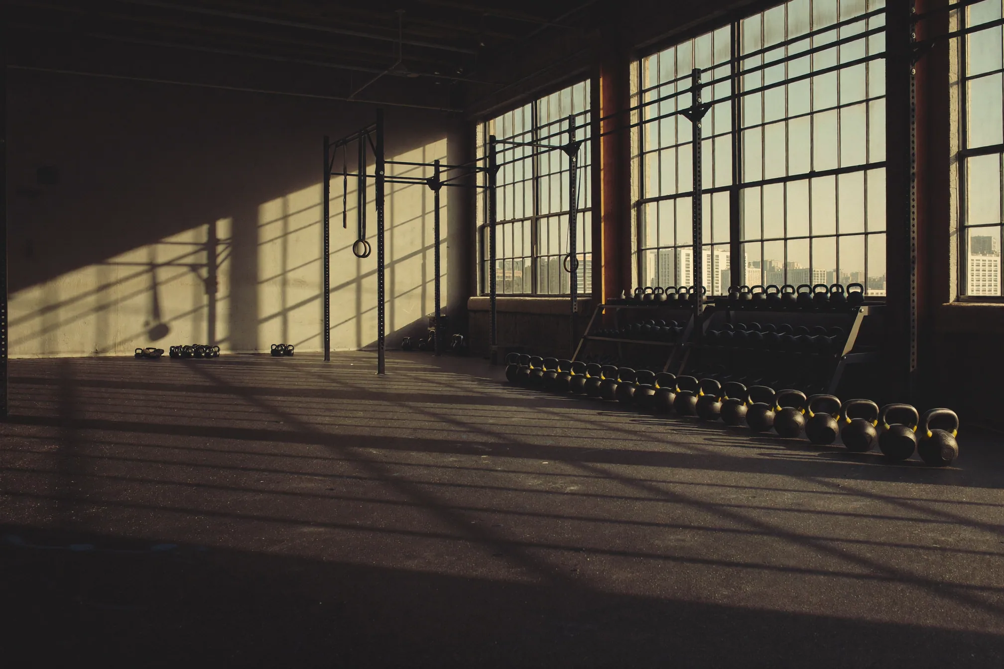
The strip reads your clock and names the next class on the timetable; filter to After 5 and the grid keeps only the evenings; select a session and the strip becomes it, with what to bring, and reserving marks the cell. Two classes this week are genuinely full. Move the membership slider to one a week and the page tells you to pay per class. Every coach, class, price and figure on it is invented, no booking is real, and nothing selected on the board is sent anywhere.
New tab — the frame above is already running it.
01 — The brief
Boutique fitness sells one website, everywhere, forever: a dark photograph of somebody mid-burpee, a word like transform, and the timetable four clicks deep inside somebody else’s booking widget. It is exactly backwards. Nobody has ever joined a studio because of a photograph; they join because there is a class at 6:15 on a Tuesday, eight minutes from the office, that they can actually get to. The brief was to build the site that starts from that fact — and to build it as the deliberate opposite of ORA, so the two of them together show what a direction actually is.
02 — The direction
The board goes first
Three moves, in the order they were made. Everything after this page — the palette, the type, the sections — falls out of them.
- 01
The schedule is the product, so the schedule is the hero
Thirty-six classes, seven days, every coach and every spot left, before anybody is asked for an email address. It reads the visitor’s own clock to say what is on next and wraps across the end of the week, it filters by class and by whether somebody can physically be here at that hour, and selecting a class turns the strip above it into that class. It is the only page in the vertical you could actually plan a week from.
- 02
Light the useful thing, not the aspirational one
Every competitor puts the hero photograph in the dark and the timetable in a pale widget. This build inverts it: the photography sits on chalk paper and the board is the one dark room, lit like a departure board. That single inversion is the design, and it is why the site reads as a studio that is confident rather than one that is advertising.
- 03
Price it against attendance, and let it say no
Move the slider to the number of sessions you will honestly make and the three plans re-cost themselves with the real arithmetic, extra-class rate included. Below three a week it recommends against the unlimited membership in writing. A studio that tells somebody to spend less is a studio that still has them in year three, and that sentence sells more memberships than the photograph ever did.
03 — Palette
The colors, and what each one is for.
Every value here is a real token in the build. A palette with a role written beside each color is a palette somebody can hand over — which is the difference between a design and a decoration.
Chalk
The ground. Concrete with dust on it
Card
Panels, class cards, the pricing sheet
Line
Hairlines and every divider
Ink
Type, and the plan that wins
Gray
Secondary copy
Quiet
Labels and axis marks. Never copy
Flame
The fill. Black on it, never white — 2.9:1 on chalk
Rust
The same accent taken down until it can set type on chalk
Night
The board, the footer: the dark room
Steel
A raised cell inside the board
Ash
Secondary copy on night
04 — Typography
Two faces, and the reason for both.
Display
Saira
Aa Bb Cc 0123
The quick brown fox jumps over the lazy dog — 1234567890
It has a width axis, and the entire brand is which way that axis is pushed. Condensed capitals are a gym flyer taped to a lamp post — the whole category defaults to them. Set wide instead and the same word reads like transit signage: official, unhurried, in charge. One decision, made at the wordmark and kept everywhere.
Text
Chivo
Aa Bb Cc 0123
The quick brown fox jumps over the lazy dog — 1234567890
The board is thirty-six sessions in a seven-column grid, which lives or dies on its figures. This is a grotesque drawn for signage, with numerals that hold a narrow column at thirteen pixels and a voice flat enough to let the times do the talking. Same family tree as the display face; a completely different job.
05 — What it does
The part a template cannot copy.
A board that reads your clock
The strip above the grid says what is on next from the visitor’s own time, wrapping into next week when it has to, and marks today’s column. Filter by class or by when you could physically be here — the only two questions anybody has.
Two classes are full, and say so
Spots left are real against a real cap: three or fewer takes the accent, full goes quiet and offers the waitlist. A timetable with space in every single class is a picture of a studio nobody goes to.
The shape of the forty-five minutes
Each class carries an effort curve — spikes for intervals, a plateau for a grind, a descending line for the one that ends on the floor. Every other studio in the world describes a class in adjectives.
Membership arithmetic, done out loud
One slider, three plans, and the real monthly cost of each at that frequency, with the cheapest one marked. It recommends the drop-in at once a week and the eight-pack at twice, which is the point.
Next in the showroom
Iron & OakShop blue