Showroom03Website + Client portal
Ledger & Co.
Ruled paper, red inkThe same paper, signed in
A tax practice that publishes its prices, works out the fee before you call, and counts down to the deadline that is genuinely next.
- Business
- Ledger & Co. — Tax & Accounting
- Where
- Coral Way, Miami
- Sector
- Professional services — tax
- Quoted as two
- Premium Websites · SignatureFrom $4,500Web AppsFrom $5,000
The websiteRuled paper, red ink

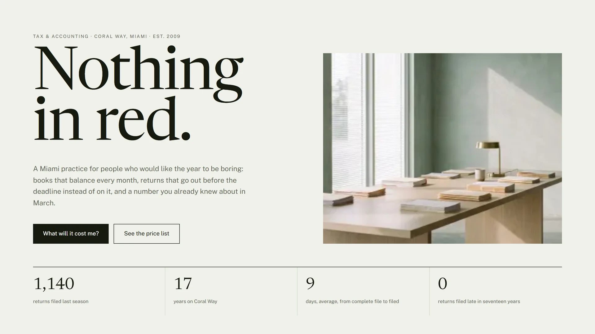
The estimate re-totals as you answer it, the shoebox line turns red and argues for the retainer, the countdown runs against the deadline that is really next, and the consult confirms with the day read back. Every name, figure, license and review on it is invented, no advice is given, and nothing typed into it is sent anywhere.
New tab — the frame above is already running it.
The client portalThe same paper, signed in
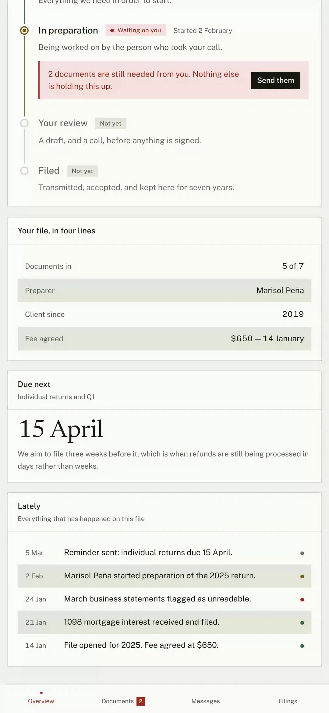
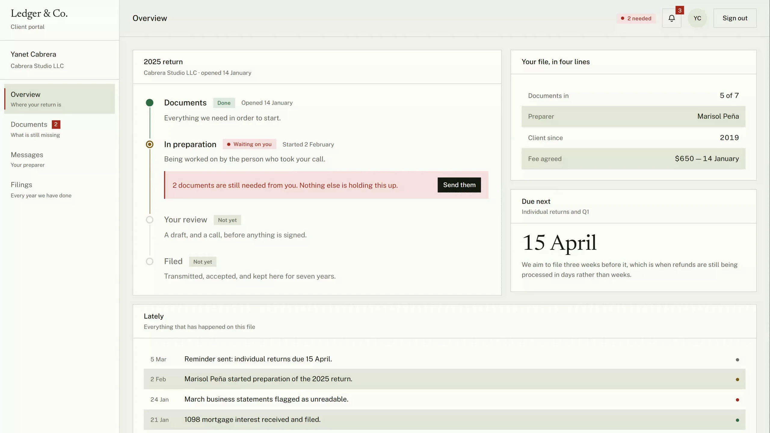
It opens on a door, because being behind one is the point. The timeline says who is holding the file up, dragging a document onto the list clears the line and offers an undo, and clearing the last one moves the return to the preparer in front of you. The client, the practice and every document in it are invented; no file is ever read and nothing is sent.
New tab — the frame above is already running it.
01 — The brief
Search any variation of accountant near me and the results are indistinguishable: a stock handshake, a blue gradient, the word trusted, and no prices anywhere on any of them. That is not a taste failure — it is the visible shape of a business with nothing to photograph, which therefore made no decisions at all. The brief was to find out what professional services look like when somebody does.
02 — The website
Ruled paper, red ink
Three moves, in the order they were made. Everything after this page — the palette, the type, the sections — falls out of them.
- 01
Design the artefact, not the industry
Accounting owns one of the great pieces of vernacular graphic design and nobody in it uses one: the columnar pad. Pale green bars so the eye can hold a row across a wide sheet, hairline rules, black ink for what is settled and red for what is not. The whole identity is that pad. The bands really do stripe the price list, the estimate and the confirmation, and red is only ever used for a figure that needs somebody — which means the site can raise its voice exactly once and be believed.
- 02
The prices went on the page
Every firm in the vertical answers what does it cost with it depends. True, useless, and it sends the visitor to whoever answers the phone first. What it depends on is four questions long — who is filing, where the records are, and what else is true — so the fee list is published and the estimator asks the four questions. The one line that arrives in red is the shoebox, annotated in the margin as the only line the visitor can make cheaper, which is how a design decision ends up selling a monthly retainer.
- 03
One dark band, and it is the calendar
The site turns to ink exactly once, for the filing deadline that is genuinely next — counted from the visitor’s own clock, with the weekend roll that makes March 15 sometimes March 17. Nobody bluffs a deadline. It is the most credible object a practice of this kind can put on a page, and it is the reason somebody comes back to the site in March without being emailed.
03 — And then they signed in
The same paper, signed in
The complaint about accountants is never the work. It is the silence: three weeks of not knowing whether anything is happening, and an email thread where the list of what they asked for is nine messages back. A practice that fixes that keeps clients for a decade. This is the fix, and it is the reason the same business is worth building twice.
- 01
It inherits the brand instead of replacing it
Same paper, same serif, same red meaning the same thing. That is a deliberate reversal of the rule the other two products follow: staff software may look like anything, but a client signing in has just come from the website, and finding a different company there turns a relationship into a subscription. Density changes; identity does not.
- 02
One question, answered everywhere
A client with an accountant wants to know one thing at any moment: whose turn is it. So the entire state vocabulary answers that and nothing else — red is yours, amber is ours, green is done, gray is not yet. Four colors, on the timeline, on every document row, in the rail badge and in the header. Nobody has to learn it.
- 03
The bad states are the demo
A document came back unreadable and says so, in red, with the reason. The timeline says out loud that two things are being waited on from you and that nothing else is holding the return up. Send the last one and the stage moves to your preparer in front of you. Software that only demonstrates the happy path teaches a client to expect software that cannot exist.
04 — Why they are one project
The website sells it. The product is what they keep.
This is the only pair in the showroom sold as one engagement, and it is the one worth studying: a business that needs a website almost always needs the second thing, and nobody sells it to them.
01One of them wins the client. The other one keeps her
The website is an acquisition cost a firm pays once. The portal is the reason that client is still there in four years when somebody down the road quotes fifty dollars less — because leaving now means going back to email attachments and not knowing where anything is. Every professional practice on earth knows what a client is worth over a decade, which is why the second half of this is an easier conversation than the first.
02The second sale is quoted against churn, not against design
A studio arguing for a $5,000 product has to argue about taste. A studio arguing for a portal after the website is live has a number to point at: what one lost client costs, times the number who leave in a year because nobody told them what was happening. That is a spreadsheet conversation, and spreadsheet conversations close.
03The same paper, so it reads as phase two
VenueOS looks nothing like LUMEN, and it is right not to: staff software is a tool, and a tool may have its own skin. A portal is the opposite — the client has just come from the website, and if she signs in and finds a different company she has been handed somebody else’s software. So the portal inherits the paper, the serif and the red. It is why this can be sold as the next phase of one project rather than as a second vendor.
04None of this is about tax
Swap the document checklist for a case file and it is a law firm. For a claim, an insurance broker. For a set of documents and a set of approvals, a consultancy or an agency. Every one of them takes documents from clients, works on them privately for weeks, and loses people in the silence. The same two products answer all of it.
05 — Palette
The colors, and what each one is for.
Every value here is a real token in the build. A palette with a role written beside each color is a palette somebody can hand over — which is the difference between a design and a decoration.
Paper
The ground. Ledger stock, faintly green
Band
The green bar. Every other row, everywhere
Card
The sheet: panels, the estimate, the form
Ink
Type, rules, and every primary button
Gray
Secondary copy, notes, small print
Red
The pen. What is owed, missing or due — nothing else
Blush
The wash behind a red row. Never type
Night
The one dark band: the deadline
Ember
The red as it has to read on ink
And what the portal adds
Four, and they are the only semantic colors in this brand: a website is allowed one accent, but a product has to say what state a thing is in before anybody reads a word of it. They sit on the same paper as everything above.
Green
Done. Received, filed, accepted, nothing needed
Amber
Ours. In preparation, uploading, waiting on us
Sage
The wash behind a done chip. Never type
Sand
The wash behind an ours chip. Never type
06 — Typography
Two faces, and the reason for both.
The same two, on both builds. The other products in this showroom deliberately do not share a face with the site they run on — but a client signing into a portal has just come from the website, and finding a different company there turns a relationship into a subscription.
Display
Newsreader
Aa Bb Cc 0123
The quick brown fox jumps over the lazy dog — 1234567890
A text face before it is a display face — drawn for long reading on screens, with an optical-size axis that lets the same family set a headline at eighty pixels and a paragraph at seventeen without either being a compromise. Every firm in this vertical reaches for a wide corporate grotesque and ends up looking like a bank’s annual report. A serif drawn for reading says the thing a bank cannot: that a person will sit down with this.
Text
Public Sans
Aa Bb Cc 0123
The quick brown fox jumps over the lazy dog — 1234567890
The typeface of the U.S. Web Design System — the sans a federal form is actually set in. Putting the fees, the deadlines and the small print of a tax practice in the government’s own face is the quietest possible way of saying which register this work belongs to. It also has real tabular figures, which every column of money on both builds depends on.
07 — What it does
The part a template cannot copy.
On the website
Four questions, and then a number
Who is filing, where the records are, and what else is true. The answers land on a ruled receipt as line items and the fee re-totals as you go — an itemized sheet rather than a single number appearing under a form, because the sheet is an argument and the number is a magic trick.
A clock nobody can bluff
The countdown runs against the next federal deadline, derived from the visitor’s clock, with weekend dates rolled to the Monday the way the actual rule does. Four dates follow it. It is right in October and it is right on April 14.
The prices are on the price page
Three services with what each one includes, three more as ruled rows, and a $0 line for answering an IRS letter. Publishing the list is what makes everything else on the page possible.
Booked in the language it will happen in
Ten working days, six slots, a third of them already taken, and a choice between English and Español that is part of the booking rather than a flag in the corner. In this market that is not a courtesy — it is half the client list.
In the portal
A timeline that says whose turn it is
Documents, preparation, your review, filed — with the stage it is really at marked, the date each one started, and a red panel that appears only while something is genuinely being waited on from you.
Drag it in, and take it back
A real drop and a real file picker, a progress bar, and a toast that says which line it was filed against and offers to undo it. The file itself is never read: the name and the size draw the row, and the interface says so.
The one that came back unreadable
March’s statements arrived as a photograph of a screen. The row is flagged in red with the reason and a resend button, and it counts against the outstanding total — the state every portal has and almost none of them design.
Seven years on one page
Every year the firm has filed, what it came to, and what was amended. Refunds in green, tax owed in red, and the 2022 amendment that got somebody $860 back sitting there as an argument for staying.
Next in the showroom
VenueOSGraphite and four states