Showroom08E-commerce — apparel
OTRO
Sand, and two loud inks
A small label that prints its own runs, sold the way it actually sells: a hundred and twenty pieces, and a clock on them.
- Brand
- OTRO — Studio & Supply
- Where
- Little River, Miami
- Sector
- E-commerce — apparel
- Quoted as
- Premium Websites · SignatureFrom $4,500
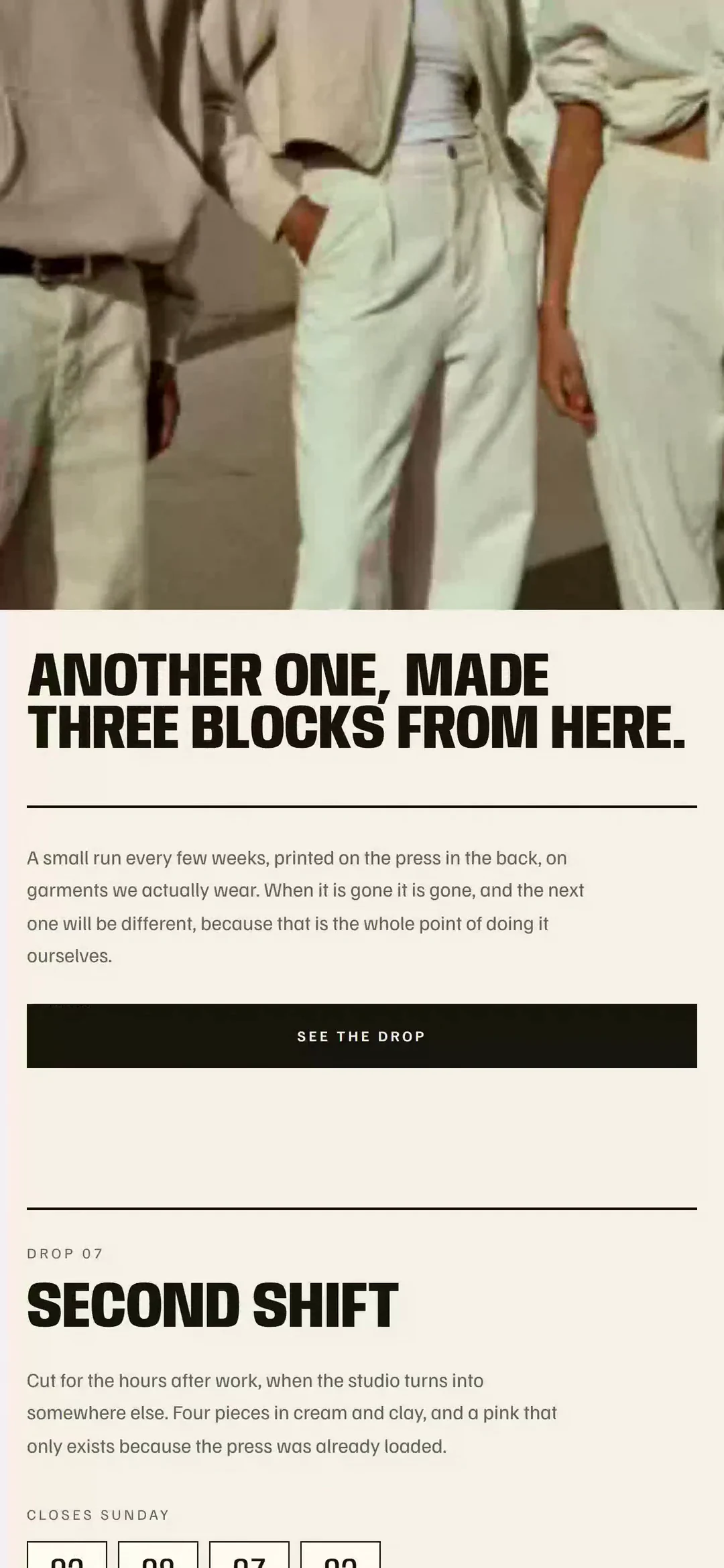
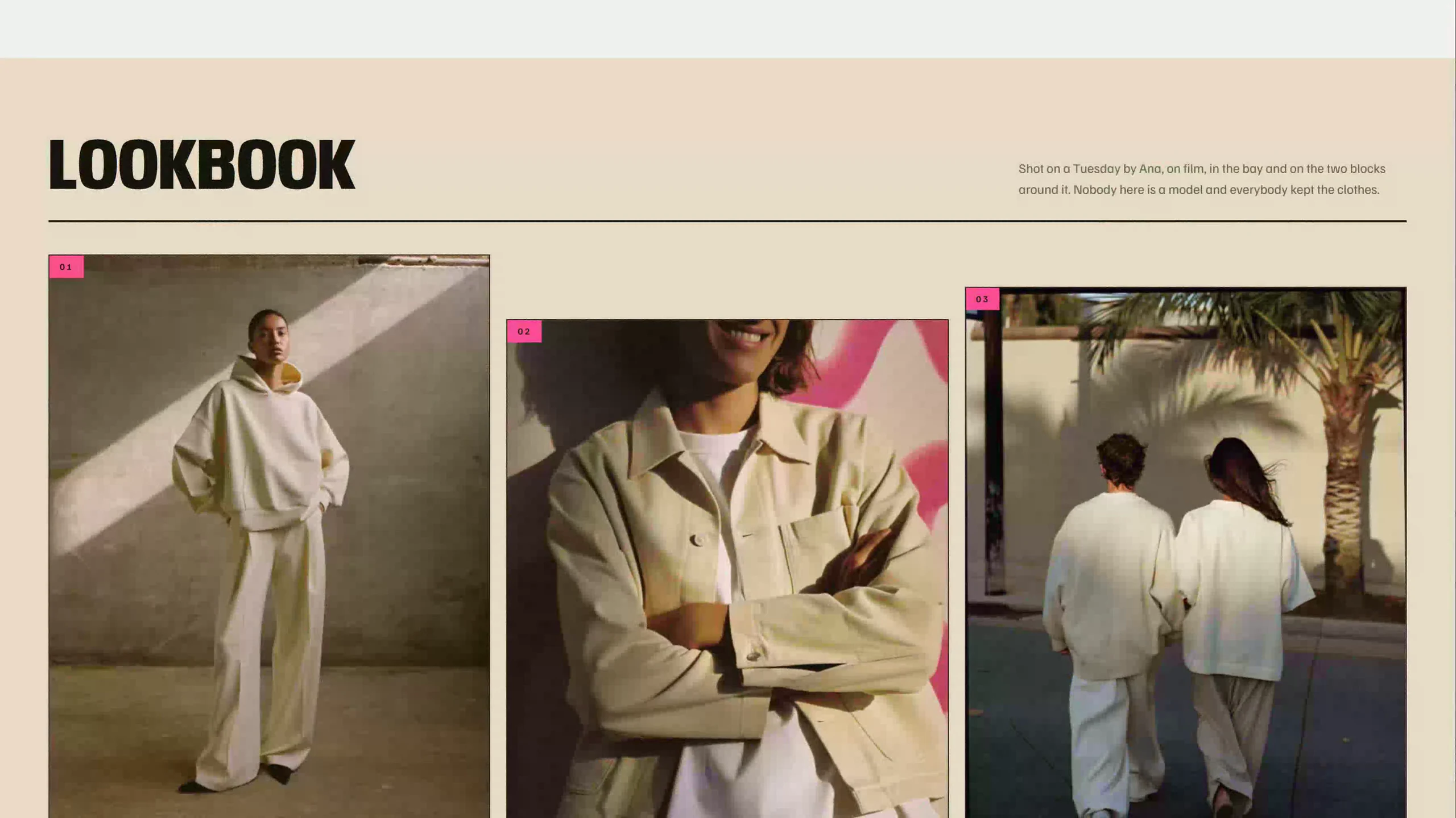
The marquee runs a live countdown to Sunday, the run bar fills to seventy-seven of a hundred and twenty, three of the four pieces have a size struck out, the button refuses until you pick one, and the bag walks two steps to a stamp that lands crooked. Every garment, price and drop on it is invented, and no payment is taken.
New tab — the frame above is already running it.
01 — The brief
The label had a following and a website that read like a wholesale catalog — a grid of garments, a filter, a sale banner. Nothing on it knew that the whole business runs on a finite run pulled by hand on a Thursday night and gone by Sunday. Scarcity was the product and the site was hiding it, which meant the label was competing on price with every dropshipper in the country instead of on the one thing none of them have.
02 — The direction
Sand, and two loud inks
Three moves, in the order they were made. Everything after this page — the palette, the type, the sections — falls out of them.
- 01
It is printed, not designed
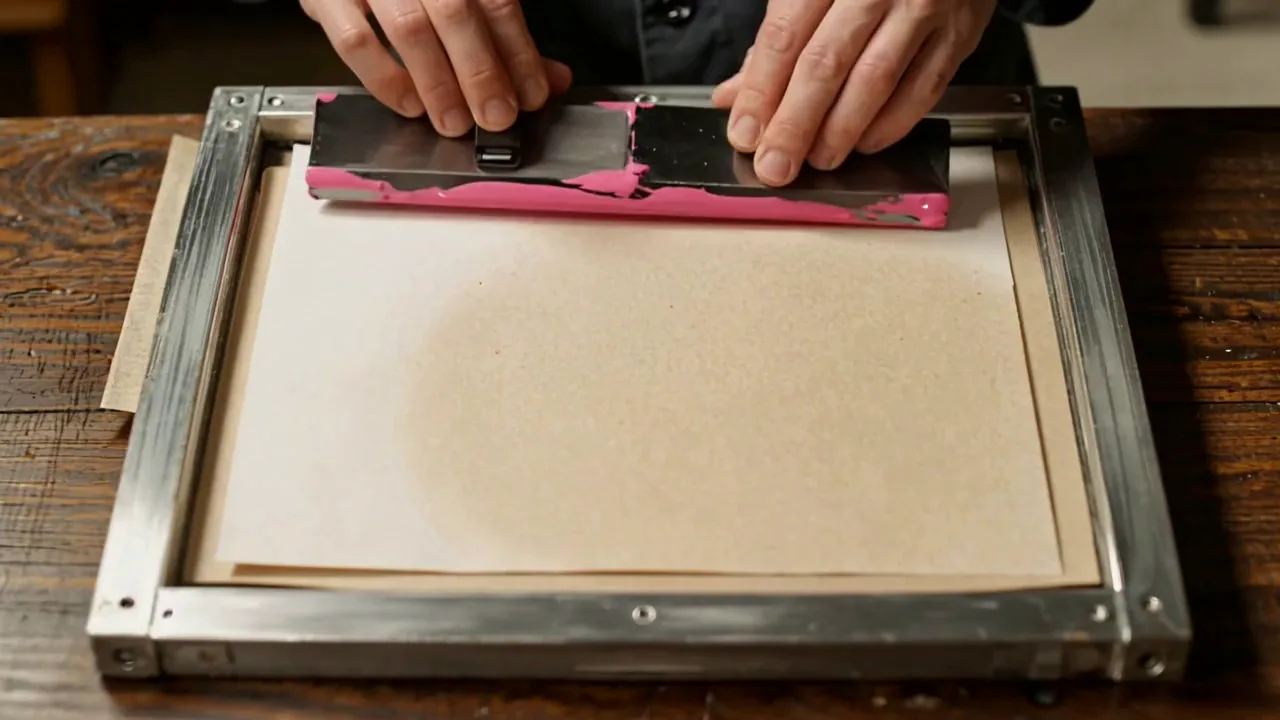
The entire system is a two-color risograph: black ink on warm uncoated stock, plus a fluorescent pink and a process yellow that only ever appear as fills and highlights and never as body copy — which is exactly what a two-color press can and cannot do. Riso is also the medium every art-school print club in the city runs on, which is the difference between a label with a community and a label with a logo.
- 02
The deadline moves
The drop closes at the end of Sunday, computed from the real clock, and it appears in the marquee, over the products and in the run bar. A countdown that always reads the same comfortable number is wallpaper; one that can say four minutes is the business model. The sizes that are gone stay on the board struck through, because a run with a hole in it is information.
- 03
One face, stretched and squeezed
Anybody carries a real width axis, so the wordmark runs wide across the sheet and the headlines compress into the column — one typeface behaving like a press rather than two typefaces faking one. And nothing is set on top of a photograph anywhere on the site: a printed sheet puts the image down in one pass and the black in another, so the type never has to fight for legibility.
03 — The identity
The mark, and everything it has to survive.
The label had a name and a press and no system. This is the one that came out of it — drawn in the same week as the shop, by the same hand, which is the only reason the two look like one business.
The mark comes out of the press
OTRO pulls two colors a night by hand, so the mark is a registration target — the crosshair a printer lines the second pass up against — and it is never quite in register. A competitor can copy the drawing; copying this costs them a second pass by hand on every garment they print.
Ink
#16150f
Pass one. The mark, the type, the rules — everything structural.
Flo
#ff4d97
Pass two, and the loud one. Fills and highlights, never a letter.
Sun
#ffd84d
Pass two, when the press is already loaded yellow. Same rule.
Page
#f6f2e8
The ground. Warm uncoated stock, and it is never white.
The mark at 26px, in ink alone.
01Off register is the mark
The spot pass sits down and right of the ink pass by a third of the stroke, always, on everything. Landing it perfectly is the one way to get this wrong.
02Under 40px it prints in ink alone
At favicon and woven-label sizes the offset closes up into mud, so the second pass comes off and the target goes down in black. A press has the same rule for the same reason.
03Never on a photograph
A printed sheet lays the image down in one pass and the black in another, so the mark goes on paper, on card, on cotton — never over an image. The website already obeys this and so does everything else.
04The loud inks never set a letter
Fluorescent pink and process yellow are fills, rules and highlights. The moment either one sets a word, the label stops looking printed and starts looking designed.
05One target per surface
A box gets one. A tag gets one. A sheet gets one, however big the sheet is. It is a registration mark, and a printer who needs two is lost.
Then it has to survive the objects
This one goes on 14 oz cotton, on uncoated board at the size of a business card, and on a kraft box under a rubber stamp. That is where the rules come from: each of those surfaces takes ink differently, and one of them cannot hold the second pass at all.
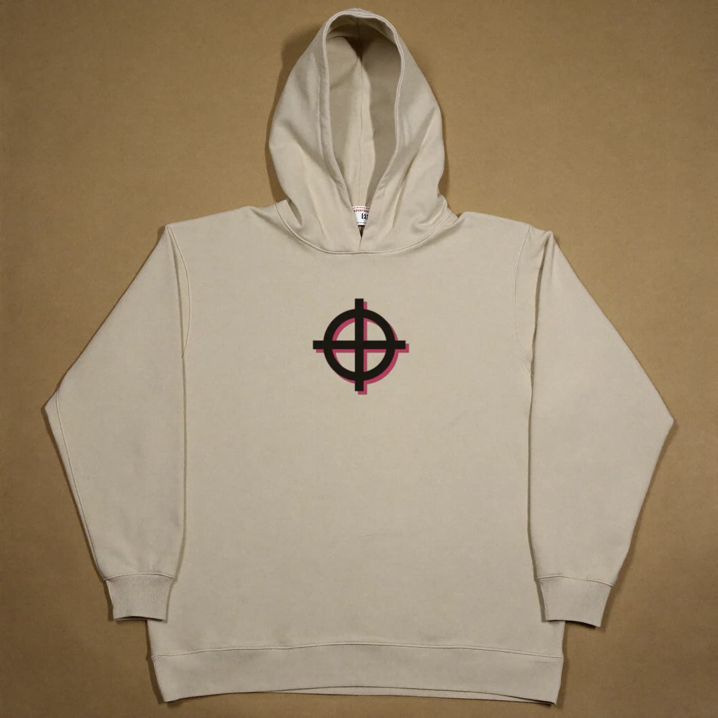
Chest print
Two pulls, one garment. The target is the second thing on the press, and it lands where it lands.
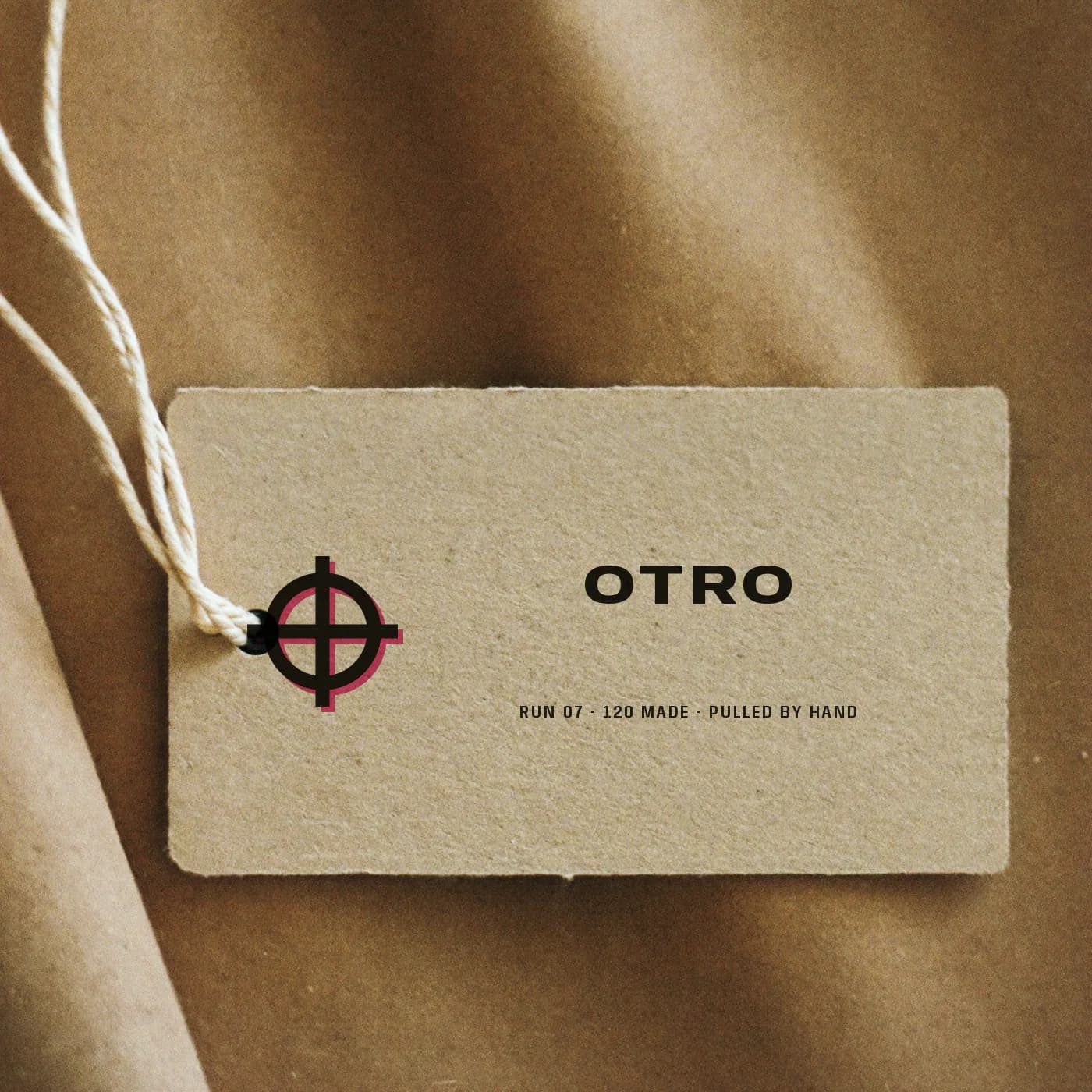
Swing tag
The run number is on the tag because the run number is the product. 07, of a hundred and twenty.
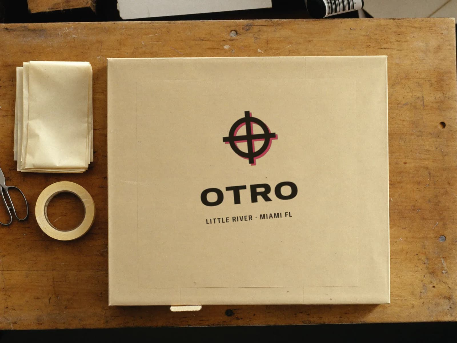
The box it arrives in
Stamped, not printed, so it leans. It is the cheapest object in the box and the last one the customer touches.
04 — Palette
The colors, and what each one is for.
Every value here is a real token in the build. A palette with a role written beside each color is a palette somebody can hand over — which is the difference between a design and a decoration.
Page
The paper. Warm, uncoated
Sand
The band ground — a second sheet
Card
Product plates and fields
Rule
Hairlines, where ink is too heavy
Ink
Type, borders, and the dark band
Smoke
Secondary copy
Haze
Secondary copy inside the ink band
Flo
The fluorescent. A fill, never body copy
Fuchsia
The pink that can be type on paper
Sun
The second ink. Highlight only
05 — Typography
Two faces, and the reason for both.
Display
Anybody
Aa Bb Cc 0123
The quick brown fox jumps over the lazy dog — 1234567890
Chosen entirely for its width axis. A label that prints its own runs sets type the way a press does — the wordmark stretched to the width of the sheet, the headline squeezed to fit the column — and buying a separate condensed and a separate extended would be paying for two typefaces to fake one.
Text
Familjen Grotesk
Aa Bb Cc 0123
The quick brown fox jumps over the lazy dog — 1234567890
A humanist grotesque with enough irregularity in the drawing to stay warm at thirteen pixels on a paper ground that eats contrast. A neutral geometric goes gray and dies on this color; this one keeps its edges, which matters because the small copy here — the composition, the fiber, where it was sewn — is what this buyer actually reads.
06 — What it does
The part a template cannot copy.
A drop with a real clock on it
The run closes at the end of Sunday, derived from the visitor’s own clock rather than from a constant, so the figure is always true and occasionally almost out. It rides inside the marquee at the top of every screen, which is the oldest trick in shop-window design and right for the same reason: a deadline that moves gets read.
Sizes that are honestly gone
One size is out on three of the four pieces, struck through and un-pressable, and nothing can be added until a size is chosen — the button says which. That friction is the good kind: the alternative is an add-to-cart that succeeds and becomes a returns problem three weeks later.
The same bag, unrecognisable
Black-headed sheet, numbered steps in condensed caps, the total set enormous, and a primary button in fluorescent pink with ink type on it. It is running the identical cart, checkout and validation as the watch house in the next case, and nobody would guess the two share a file.
A confirmation that is a stamp
Not a tick. A crooked fluorescent box reading PACKED, landing the way the studio actually marks a box, over a receipt that promises a sticker nobody asked for. The last screen is the one a customer photographs, so it is the one that has to sound like a person.
Next in the showroom
ORADaylight, and a plum line